
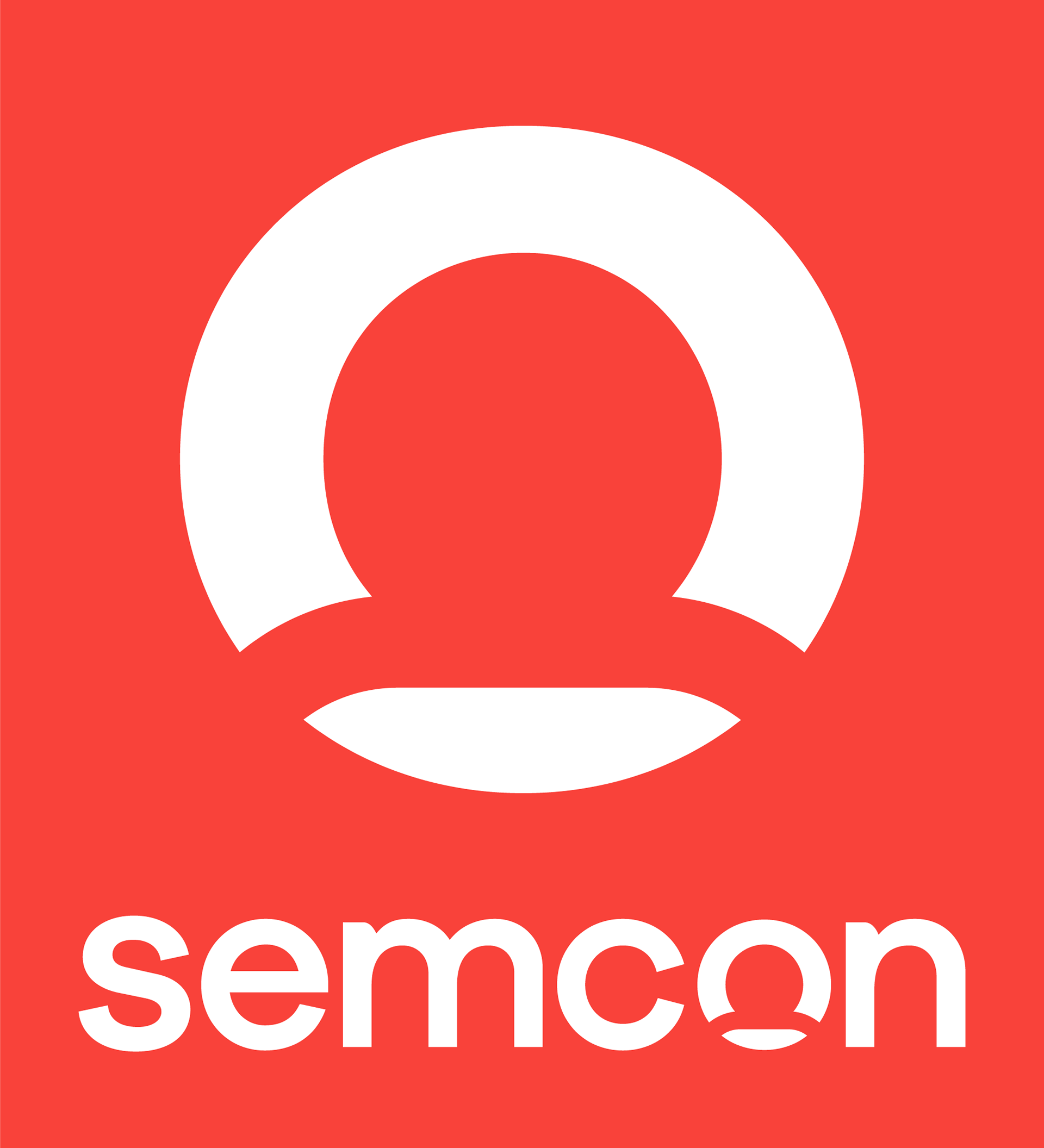
After several tries by the agency having been tasked with designing the new Semcon logotype, the task was given to me to adjust the design and come up with a figure mark the organisation could get behind. Several options were tried. A person in the letter O, representing all the consultants at Semcon and all the people we are helping was finally decided on.
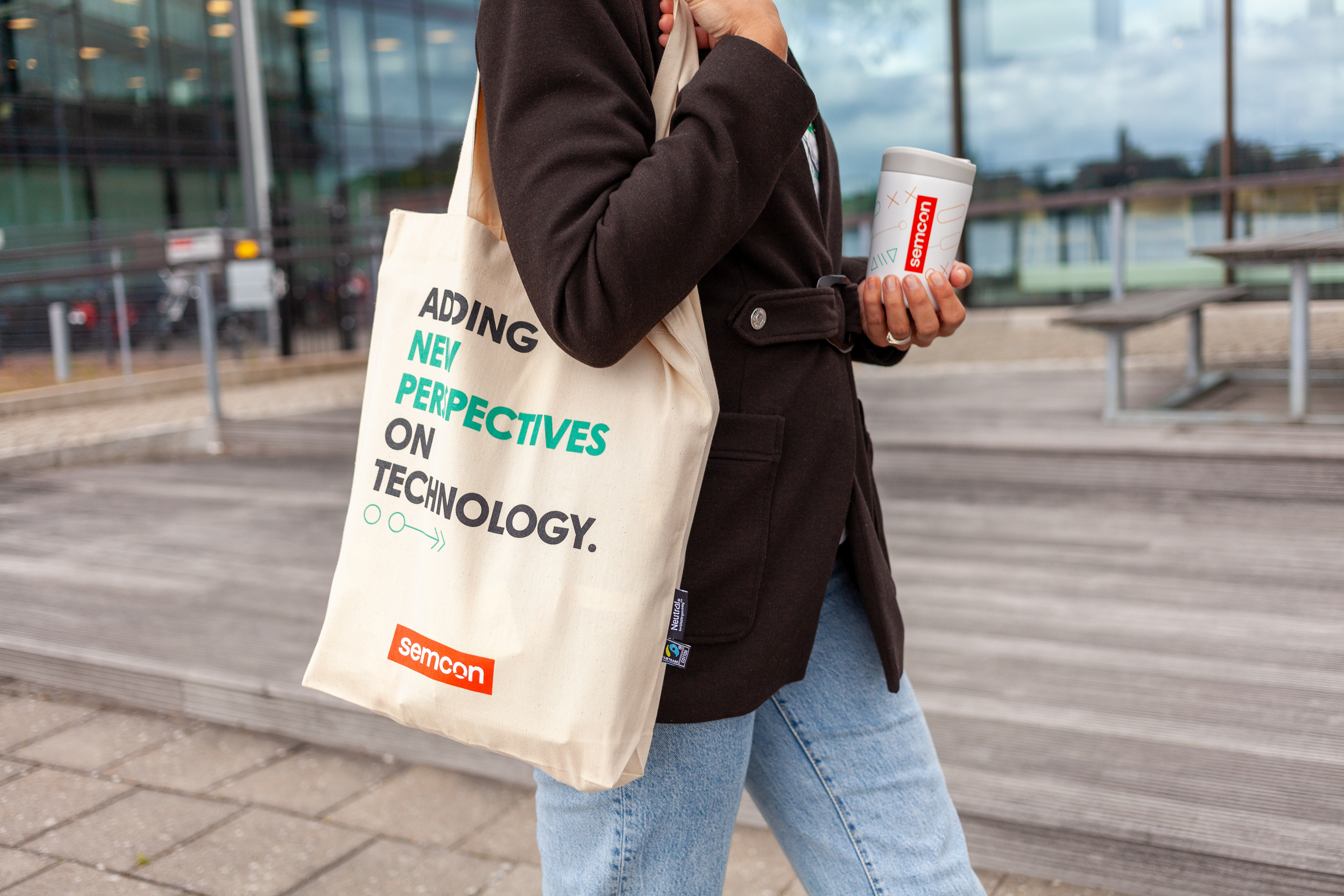
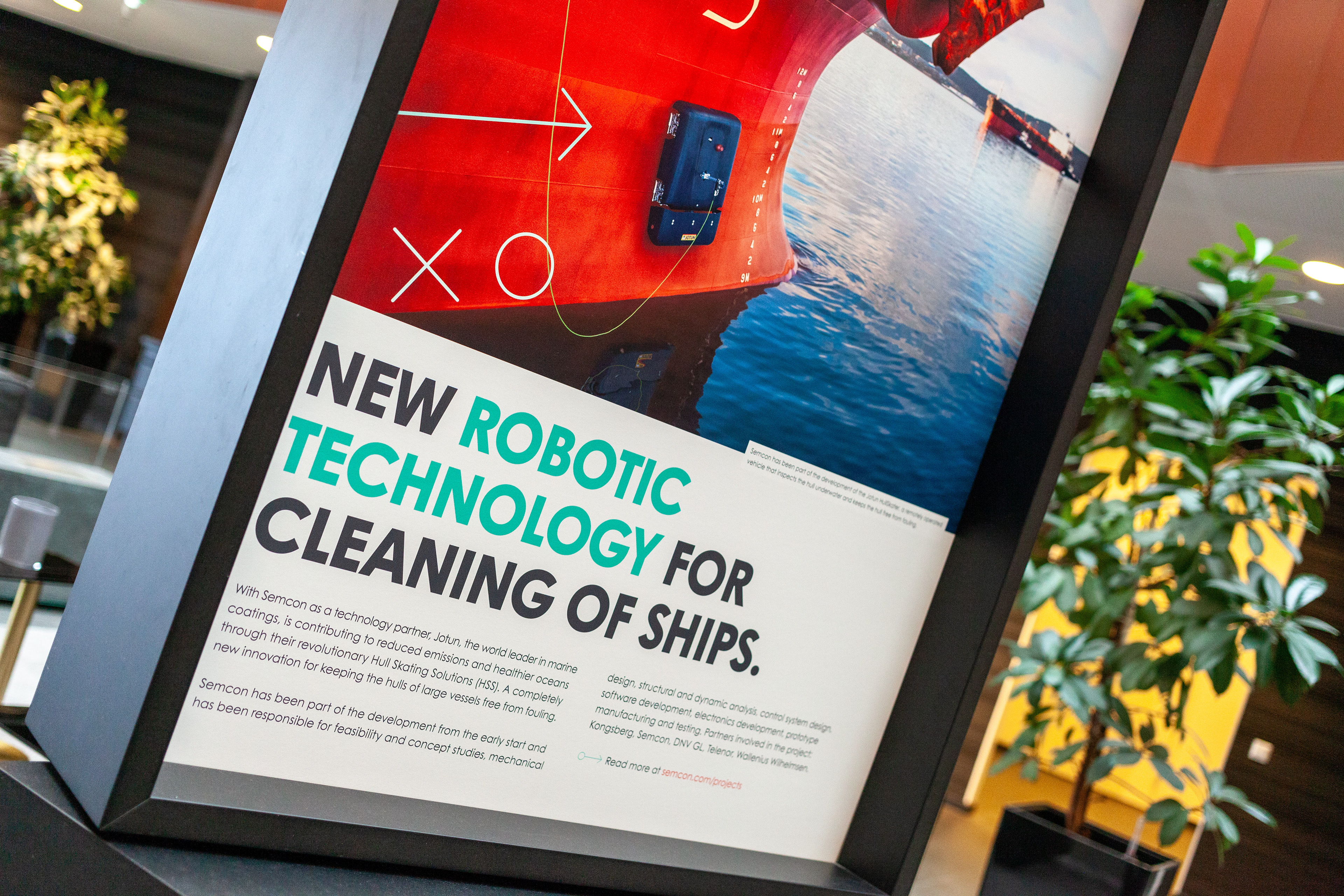
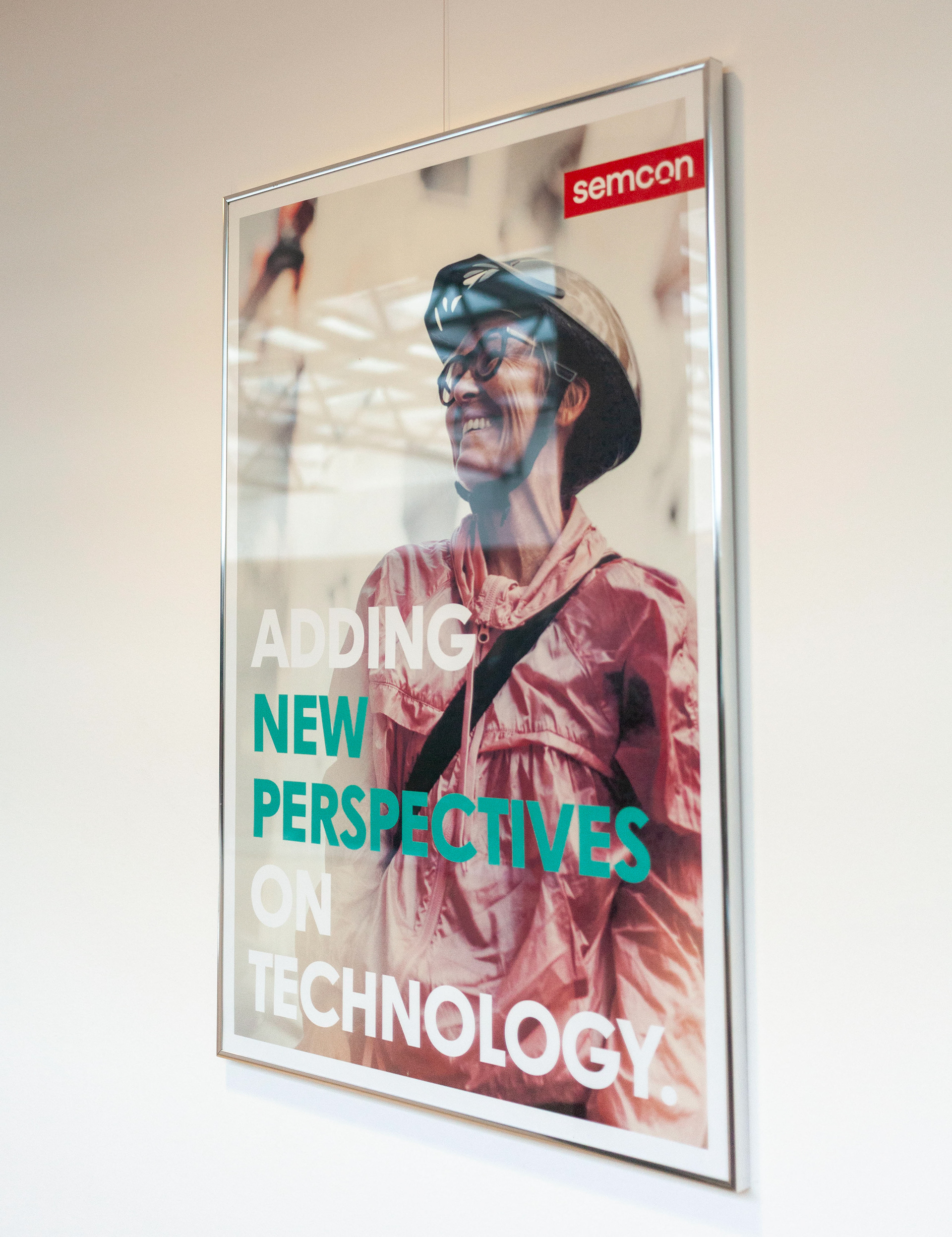
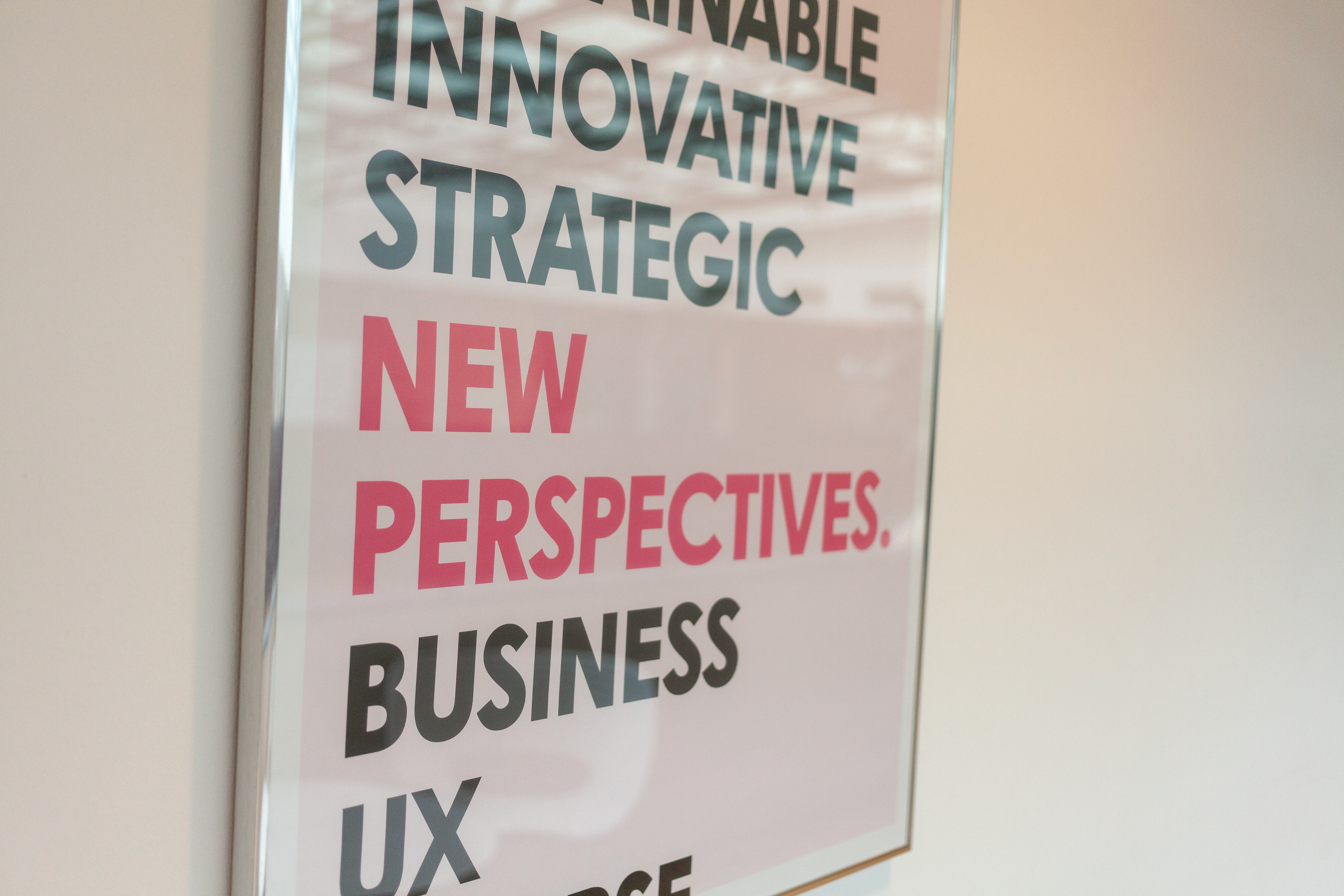
This was part of a brand revamp, where we wanted to reenergize the brand and keep it colorful, joyful and inviting. Contrasting Semcon to the general visual look of our competitors.


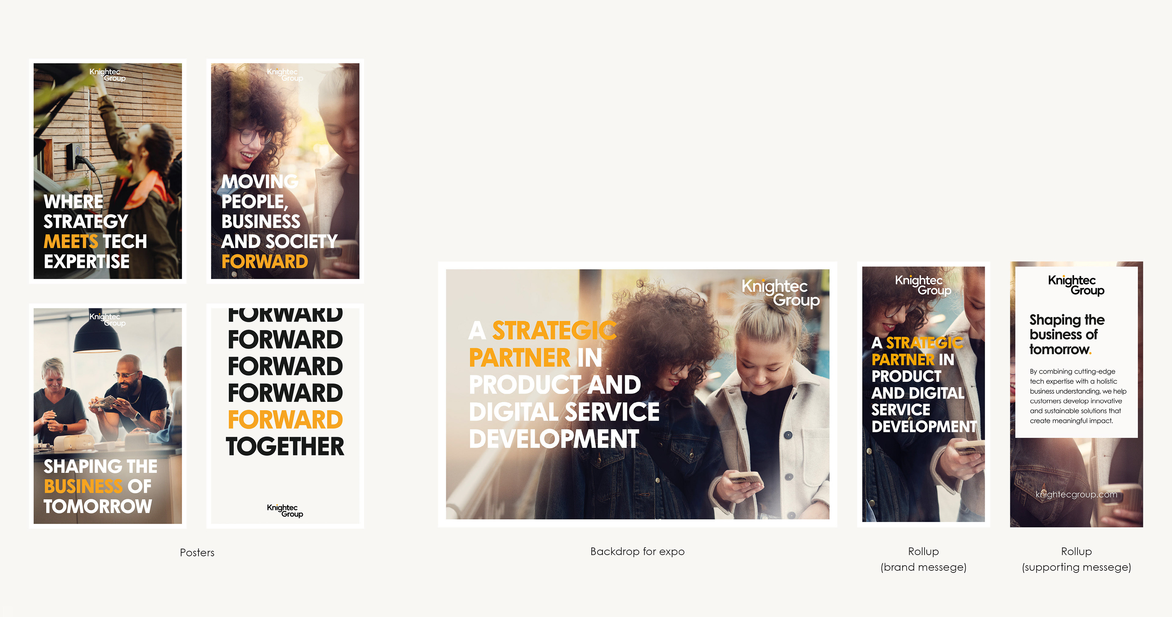
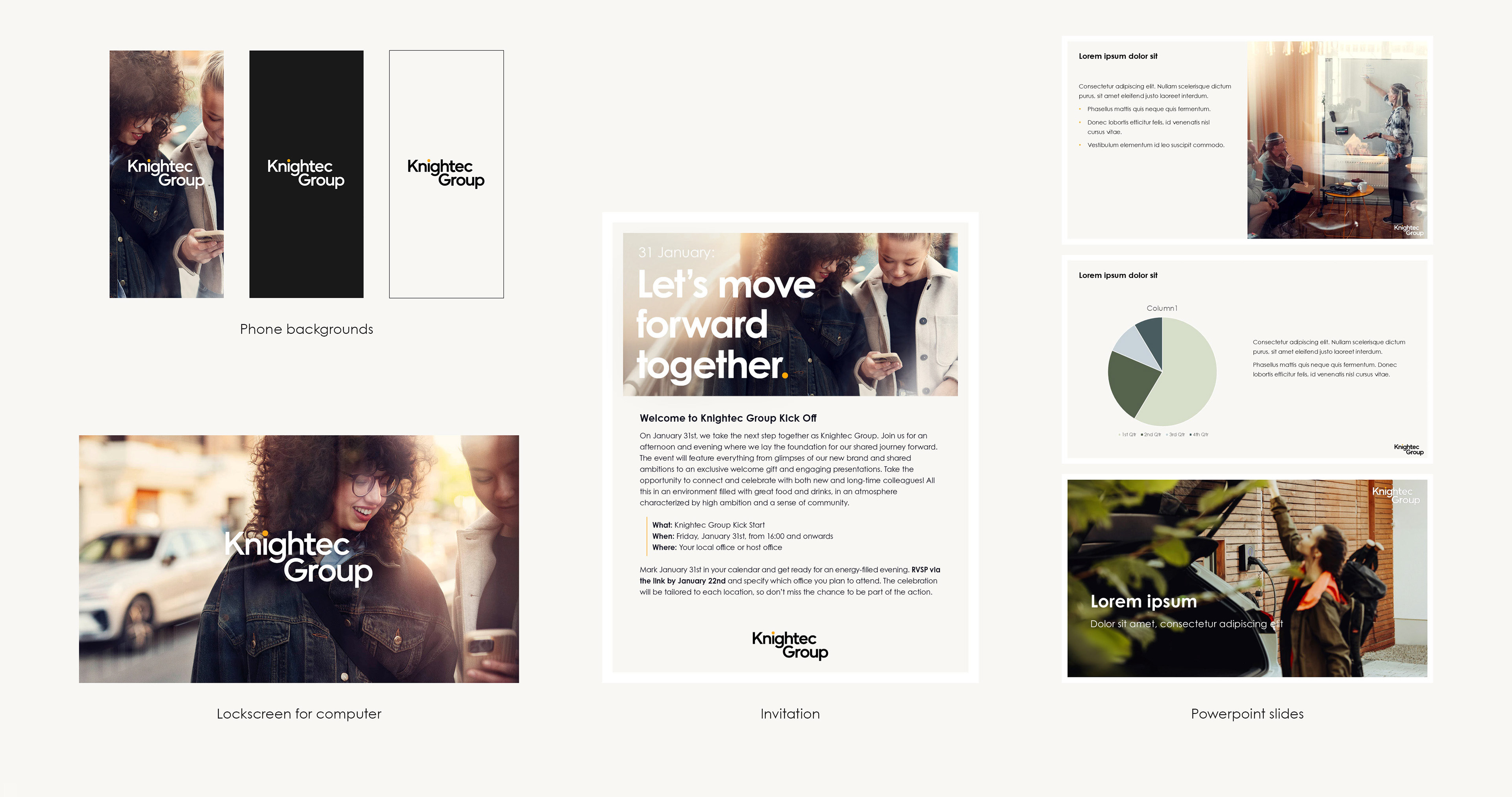
Semcon merged with the company Knightec, forming "Knightec Group". The new brand was all designed inhouse. A cleaner and stricter visual identity was the brief. A goal was to try and keep some DNA from both companies identities.